How We Built a Landing Page That Explains, Sells and Builds Trust
We created a clear, modern and conversion-focused landing page for Red Bananas — an agency that connects brands, creators and partners through performance-driven digital solutions.
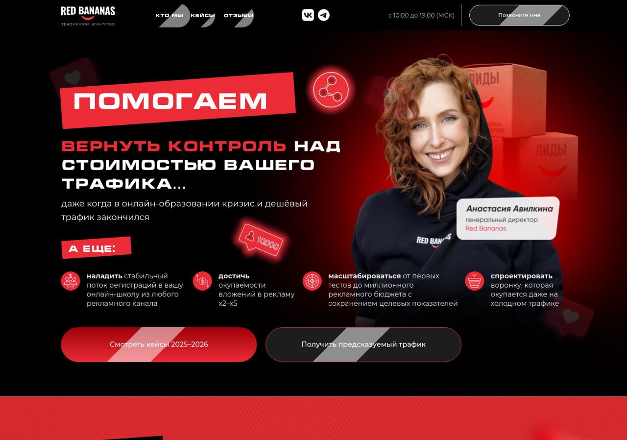
What the landing page had to solve
Explain the agency fast
Visitors needed to understand what Red Bananas does within seconds, without scrolling and guessing.
Build instant trust
The page had to feel credible to potential clients who had never heard of the agency before.
Show expertise, not noise
It had to demonstrate real expertise without overwhelming people with walls of text.
Speak to cold traffic
The structure had to be clear for a cold audience arriving from ads, social media or direct links.
Guide toward action
Every section had to move the visitor from curiosity to a clear next step — an inquiry.
How we designed the landing page
We treated the landing page as a tool for trust, sales and clarity — not just a beautiful page.
Considered structure
A deliberate page structure that leads the visitor step by step instead of dumping information.
Sharp first screen
A clear first screen with an offer that is understood in a single glance.
Value over services
The focus is on the value for the client, not just a dry list of services.
Logical narrative
A logical flow of blocks: who we are → what we do → why we are trusted → how to start.
Modern visual style
A bold, modern, agency-level look that still stays clean and easy to read.
Mobile adaptivity
Fully responsive layout, designed mobile-first for users coming from phones.
Fast loading
A lightweight build that loads fast so visitors never wait or lose interest.
Clean UX
Convenient navigation and clean UX with no unnecessary visual noise.
Scannable content
Content that is easy to read and understand within a few seconds of scanning.
Decisions you can see
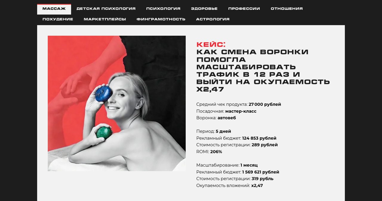
Real screenshots from the live landing page — and why each block is built that way.
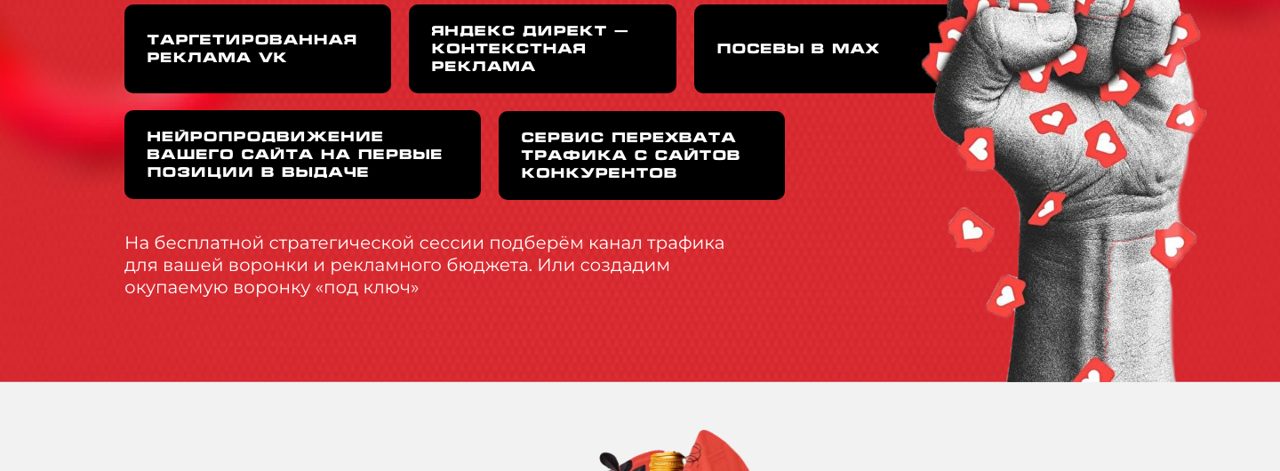
Services shown as a clear grid
Instead of long paragraphs, the offer is broken into scannable blocks. A visitor understands the full range of what the agency does in a single glance — that is the logical narrative in action.
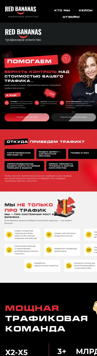
Built for the phone first
Most visitors arrive from ads and social media on mobile. Every block stacks cleanly, the offer stays readable, and the call to action is always within reach — no pinching, no horizontal scroll.
What makes this landing page strong
Clear positioning
The landing page quickly explains what Red Bananas does and why it matters for potential clients.
Trust-building structure
The page is built to reduce doubts and guide users through the agency's value step by step.
Conversion-focused flow
Every section leads the visitor closer to taking action — from understanding the offer to contacting the team.
Modern visual identity
The design feels bold, fresh and agency-level, while staying clean and readable.
Mobile-first experience
The page is optimized for users who open it from mobile, social media or direct links.
Easy-to-read content
The copy is structured for fast reading: short sections, clear headings and strong visual hierarchy.
How the page feels to a visitor
Immediate clarity
The client instantly understands what the agency does.
Nothing to hunt for
There is no need to search long for the key information.
Modern and trustworthy
The page looks modern and inspires trust at first sight.
Easy on a quick scan
The texts read easily even during a fast skim.
Helps decide
The visual structure helps the visitor make a decision.
Feels like a presentation
The site reads like a full presentation of the agency.
A landing page that works as a digital presentation
The result is a landing page that works as a digital presentation for Red Bananas: it explains the agency's offer, highlights its strengths and helps potential clients move from interest to contact.